EXPERIMENTATION
Title And Logo Design
Games Monthly
This name is very generic and boring however gives the point across to the viewer as to what the website is about. It limits my ability to create an interesting logo however as there isn't much to base off. The major issue with this title is it may limit the amount of content i am able to publish at any given time. An example of where this may become an issue is if i begin posting weekly or daily and then the question gets asked: "Why is it called Games Monthly, if its not done monthly".
The logo is simple yet colourful and detailed, it shows someone with a controller and headset playing a video game, if i was to do the logo for this again i would have incorporated more emphasis on the monthly part with maybe a calendar or a clock to indicate time.
Gamer Frontline
This name is probably my favourite out of them all, this is because it gives the idea that this is the last and best place for all gamers to go for their needs whether that be review based or not. The name is not something which i can see being used by another review company and therefore i can have free range on my designs etc.
The logo is simple with just the text in different fonts and sizes on the page, the colouring is bland and not very attention grabbing. However the lines going through the back of the text are a clever play on Front"Line". If i come to do a second draft of this logo i would like to look at other examples and take some inspiration from them, i would also like to make it more attention grabbing by using colour.
Gamers Paradise
This name is very generic and also however presents a good light as to what the website is and stands for, it indicates that it is a nice place to go for all of your needs and tied up with reviews will allow you to live up to the name. The name also makes it feel as if it is the best of the best and somewhere regal and professional etc.
I feel the logo supports the name in giving it a posh and sophisticated look, the colours in the logo give it an expensive kind of look which support the idea that it is professional etc. If i was to do this logo again however i will look at adding some more variations in colour such as the introduction of silver and bronzes etc.


Graphics Editing With Reflection


Before
After
In this demonstration we were shown the skills needed to touch up an image and make it more pleasing to the eye. We aimed at covering some of the imperfections and blemishes in the skin in order to make the face look smoother. As well as this small features such as eye colour, image brightness and loose hair tidy-ups were fixed in order to give the image a cleaner look. If however i was to add anything to this or do it again at a later date i would fix and add some more colour to the lips as they remained the same and i feel like that could add some effect to the image.


Example 1
Example 2
+
=
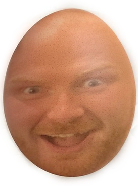
Here we were shown how to take two independent images and combine them together using a variety of photoshop tools to make them seem as if they were one image. We used skills such as blending, clone stamping and colour matching to try and give a seamless look when both images were combined into one. These skills however are not just limited to combining person to person images but also allow you to combine just objects but also people to objects, so in this example i have taken a face and added it to the face of an egg ensuring that small features such as the egg textures can still be seen behind the image of the persons face.
Example 3


+
=
Front Page Design And Typography

The major difference which we explored during this task is rather than using a standard font and pattern etc we were taught how to create and form our own letters out of shapes etc. In order to create the above image i used a variety of shapes and slices to create the letters. I then went over the letters with an accented colour and pattern brush to give that white paint effect that is all over it. As well as this because frontline is a police supporting charity i put the thin blue line behind and through the text which is a symbol of support for the police.

I decided i was going to do my front page based on what my single page article is covering rather than what was featured in my double page spread. This is to prevent the game included in my double page spread from appearing too many times throughout my magazine and therefore taking the limelight. I want the other features of my magazine to be equally represented throughout as well and have therefore added some of what's featured inside at the bottom. I have ensured my colours are bright and the fonts are interesting and also easy to read etc.

Double Page Spread Review
When creating this review and double page spread i first wrote it up into a google docs file so that i could ensure it was grammatically correct and had all of the right punctuation before putting it into photoshop where i added the graphics, boxes and background. Overall i am really happy with how it turned out, it gets the point across of what i am talking about and also corresponds with what is being spoken about in my review. If i was to do this again i would like to experiment with the text positioning to see if i can make it possible to see more of the background. To combat this for now however i turned the text box opacity down so that you could see through it at all of the characters etc on the background.
Game Review Presentation
Game Review Presentation Script
Hello, my name is Callum and I am currently studying in my second year of a level 3 in esports and digital marketing. The project I am currently working on revolves all around games journalism. I am enjoying it as it is allowing me to collect all of the relevant skills and information that is necessary for me to create a similar outcome of my own.
In game reviews it is often common practice to only talk about that specific game. With all of the things I have learnt so far I have been taught that this is not the case, it is important to look at the wider scale at things such as the developers and their previous or future work. This is important as it can shed light onto certain questions and aspects of the game that is being reviewed which will give the viewer a better understanding of what the game is like.
The game I decided to review is called The Finals. The game itself is a gameshow style shooter game where multiple teams go head to head in heated battles and exchanges in an attempt at winning specific game modes. This game is a new release so not many reviews or gameplays have been made on it however all of the feedback and opinions on the game that i have heard so far is extremely enthusiastic and positive
It is important to note that a lot of early access game reviews come as a result of developer requests and incentives such as early access to the game, as a result it is important to look around at a wider range of reviews to ensure that the information you are receiving is completely truthful and unbiased.
The game is one of the most revolutionary new releases that I have seen in recent times, with its unbelievable physics allowing for whole buildings to be destroyed using an explosive as well as its interesting physics and shooting mechanics. I would rate this game 90/100 with only a few improvements being to reduce the amount of in-game microtransactions to allow the wider community to experience the same areas of the game as everyone else.
Thank you for watching my review and I hope you enjoyed it as well as found it helpful.
1 Minute Game Review
1 Minute Game Review Script
The finals is a game show style shooter game. It has both single player and multiplayer capabilities. It follows the narrative that players are inside of an arena competing against each other in teams for a specific goal. The graphics and art style are something which make the game like no other on the market at the minute and then tying that in with the never before seen damage mechanics makes the game one for all to play at some point. The ability to destroy whole buildings using explosives makes the game completely different every single round you play. The finals went through a month of testing time which i was fortunate enough to play and now that the game has been released fully i can genuinely say that it is even better now than it was before. It is free to play with only some in-game microtransactions so there is really no excuse not to pick it up and try it. It is genuinely unlike anything else out there and I see its success growing to expediential levels. It is important to remember that the game is still in its early stages so there may well be issues that will be rectified by the developers. In conclusion, I am personally really looking forward to what this game has to offer and I would be keen to see the success that will come as a result of this. Thank you for listening to my review.