OUTCOMES
Drinks Product Practical Creation

This image shows the scanned document which outlines all of the relevant dimensions of both the bottle and the label itself. This is beneficial as it shows my thought out journey from start to finish.
This is what the scaled up logo size looks on the bottle. I just used a plain piece of paper to get an idea of how it transfers onto the bottle, no tweaks were needed to the dimensions so we can proceed straight to printing the actual label onto the bottle.


After i had determined the dimensions were correct and aligned with the plan then i could proceed to creating the labels themselves. Here in the left image you can see the careful process i took to get all of these labels cut out equally and accurately. I believe i achieved this as in the image on the right it is clear that the label fits on the bottle within the masking tape guidelines which were transferred onto the bottle to ensure accuracy. I then used masking tape to temporarily secure parts of the label in place on the bottle so i could remove the sticky side of the paper and apply it carefully to the bottle.

Just before i was due to take some pictures of my product i realised that it was important for me to ensure that the colour of the inside of the bottle matched that of the final product. Therefore i created a test batch using my ingredients to achieve this. I found this helpful for a second reason as it was the first time i had tried the batch all together with my ingredients and it did taste very nice and therefore it is something i feel comfortable releasing.

During the physical creation of my drinks product from start to finish, i felt it was important to fully document and evidence the process so that my thought process can be seen and it can be understood that alot of supporting work was necessary to create this drink. I enjoyed this process as i have always been fairly good at crafts and creating things so this was a lot of fun to me.
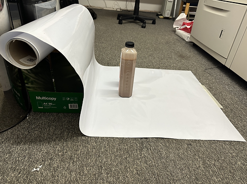

Here i have evidenced and demonstrated the process in which i undertook to create a makeshift photo studio to take some good pictures of my physical drinks product.
This is the final image taken to evidence the physical product of my drink. It was really exiting to see it actually in front of me after all of this time seeing it only through a screen.
Branding Package

Poster And Flyer


Throughout my poster and flyer i tried my best to follow all guidelines set out by my branding package and colour palette. The biggest variation away from my colour palette was in my Flyer, this is because i felt i needed to add more colour to it so that the information was more attention grabbing and memorable. I am very happy with how my poster and flyer turned out with a unique addition of the chocolate swirl to my flyer. This forces the eyes over to a certain areas of the screen which allows me to direct attention. Next time however i would like to try and give myself a larger colour palette so that i could show consistency from Idea Creation - Planning - Final Outcome.
Promotional Video
In this video i ended up having to animate the shots that featured the bottle, this is because there were major issues with the green screen removal of the real shots. I still followed my storyboard and managed to replicate the real life shots as best as i could. Overall i think this turned out better than if i had used the actual footage and i am happy with how it turned out. If i was to do this again i would take further care in ensuring the green screen will remove properly when im actually filming the footage.